DESIGN PRINCIPLE
DESIGN PRINCIPLE EXERCISE.
27/08/2019 - 26/11/2019
(WEEK 1 - WEEK 14)
Angdio Nagarico (0340052)
Design Principle Exercise
LECTURE
Week One: (ABSENT) Learning about the meaning of contrast in design principle and using black and white papers as examples.
Week Two: (ABSENT) Learning about Gestalt which is sort of an illusion from a thing that we see that could be something else.
Week Three:(ABSENT) Symmetry, Asymmetry, and balance.
Week Four: Creating a pattern or texture using vegetables as the materials as a stamp that we carved into certain shapes and put some paint on the carved veggies and stamp it onto a piece of paper to create some sort of pattern.
ASSIGNMENTS or PROJECTS
Week TWELVE:
Final Project
Week ELEVEN:
Project 2 and Self-portrait
Week TEN:
Week ten is the day of project 1, where we go to the Ilham Gallery and make an essay about it.
Week NINE:
No classed due to Deepavali.
Week EIGHT:
Symbolism, Image, Words
option and then crystallize.
Week SEVEN:
Harmony, Rhythm, Movement
In this assignment what I have chosen to create is the movement work, as you can see that there's a movement where the line shows and also the gold papers that creates the zig-zag movement.
Week SIX:
Dots, Line, Scale
In this picture, it was my first attempt of trying the dots, line, scale assignment. I choose to use the dots because I think that it was easier than the line and scale as if with dots we can create whatever shapes that we want to make and in this picture I have decided to create a rose but only with dots.
What I did here is by using types of lines and create an object, as in the picture above, I have created a drawing of a cup of coffee but only with the help of certain lines.
The same as the rose but only in here I'm creating the G note key
In these pictures that I have created is an old tree but it was drawn with multiple lines.
Week FIVE:
Alignment, Hierarchy, and Direction
The recycled materials that I've used in this assignment are basically only a paper bag and I choose to make one line perspective by cutting the paper bag into little pieces and then stick it together and make a shape of a road.
Week FOUR:
Week THREE:
27/08/2019 - 26/11/2019
(WEEK 1 - WEEK 14)
Angdio Nagarico (0340052)
Design Principle Exercise
LECTURE
Week One: (ABSENT) Learning about the meaning of contrast in design principle and using black and white papers as examples.
Week Two: (ABSENT) Learning about Gestalt which is sort of an illusion from a thing that we see that could be something else.
Week Three:(ABSENT) Symmetry, Asymmetry, and balance.
Week Four: Creating a pattern or texture using vegetables as the materials as a stamp that we carved into certain shapes and put some paint on the carved veggies and stamp it onto a piece of paper to create some sort of pattern.
ASSIGNMENTS or PROJECTS
Week TWELVE:
Final Project
About PASAR SENI.
Pasar Seni or also known as Central Market is located at Jalan Tun Tan Cheng Lock (Foch Avenue). Pasar Seni is a market that sells types of Malaysian cultural stuff and also arts and crafts, before it Pasar Seni was a store for selling arts and crafts, Pasar Seni was originally built in 1888 by the British colonial in British Malay and it was used to be as a wet market for Kuala Lumpur citizens and tin miners.
 |
| FIGURE 11.4 central market |
 |
| FIGURE 11.3 lanterns hanging |
 |
| FIGURE 11.2 signs hanging |
1. Attraction
- kinds of shops selling things from different countries.
2. Current Activities
- lots of tourists buying some souvenirs from a different store.
3. Types of people
- foreigners from other countries.
- local people that live there.
4. Visual Elements
-lots of different types of stores.
-signs hanging from the ceiling.
-lanterns hanging from the ceiling.
-lanterns hanging from the ceiling.
 |
| FIGURE 11.5 final project |
RATIONALE
The reason that I am choosing this portrait as my final project is because of the way it represents myself as a person from Indonesia with how the background itself is representing the color of red and white which is the color of the Indonesian flag, and also the way the pattern itself which is what we, Indonesian people, called as the Batik, and besides the background, I also decide to make myself as the color of the Indonesian flag. So overall, this picture of me standing is a message that I am proud to be an Indonesian person.
The reason that I am choosing this portrait as my final project is because of the way it represents myself as a person from Indonesia with how the background itself is representing the color of red and white which is the color of the Indonesian flag, and also the way the pattern itself which is what we, Indonesian people, called as the Batik, and besides the background, I also decide to make myself as the color of the Indonesian flag. So overall, this picture of me standing is a message that I am proud to be an Indonesian person.
Project 2 and Self-portrait
Self Portrait
1. Place = KLCC
2. Visuals =
- Lots of foods
- Lots of shops
- Lots of tourisms
- Lots of restaurants
3. Sounds =
- Music
- The movie
- Food being prepared
- Footsteps
4. Smells =
- The smell of foods
- The smell of new shoes inside the shops
- The smell of pastries
- The smell of perfumes
ADDITIONAL INFORMATIONS.
KLCC or Kuala Lumpur City Centre is known as one of the high-class malls in Malaysia, the extravagant or fancy fashion malls, and the Petronas Twin Towers. The construction of KLCC was started on the 1st of January 1996 and it was also open on the 1st of January 1997, for exactly one year of constructing KLCC.
HOW KLCC CONNECTS TO ME.
The first thing that came to my head is that KLCC is a very fun place to visit and I am also a very fun person to be with, so, there's that and the other thing is that the place itself is a place where there are a lot of different cultures goes there and me myself also has learned more than one culture because growing up on my father's sides of the family really taught me a lot about types of different culture that we have now.
WHO AM I?
My name is Angdio Nagarico, I am an 18 -year-old male, I used to be the only child but my father remarried to another woman and now I have a little brother. I’m good at imitating mickey mouse’s laughs but I’m not going to do it. I was born and raised in Indonesia, Batam on the 23rd of December 2000, therefore, I’m an Indonesian, but my family is part Chinese so, a part of me is Chinese and the other part of me is Indonesian.
HOW HAS CULTURE AFFECTS ME?
Growing up as a child both of my families are not fully Indonesian, meaning that some of our great grandparents are part Chinese and part Indonesian and that is how our generation has created, the Indochina. Living with my father's side of the family has affected me in many different ways, for instance, the languages that they used daily, the way they greet other people, and how they have certain manners that we could not find in the other place. Another way how culture has affected me is the surrounding itself, for example, how people that live surround us and the modern world surrounds you could create an impact on your daily life.
HOW DO OTHER SEE ME?
· Some people see me as a really funny person.
· Some people see me as a generous person.
· One person sees me like a fish ball.
· Some people see me as a caring person.
HOW DO I SEE MYSELF
· I see myself as a sarcastic person.
· I see myself as a person who can’t be on time
· I see myself as a person that needs to be accompanied by because if not I will do stupid stuff like buying things that I don’t need until 500rm (true story).
· I’m a slow person.
MY SELF-PORTRAIT
 |
| FIGURE 11.1 MY SELF-PORTRAIT. |
RATIONALE
The work that I have created is all about my personality and me, what I'm trying to explain here about my self-portrait is that I want to let people know that I am a funny person and I am also a bright person. As you can see in this portrait of myself the expression of my face can be quite disturbing to some people and it can also be really funny but according to my the situation that I had before, every one who sees this picture of me immediately laugh but not only that I wanted to show other people that I'm a funny person but I also wanted to point out the design principle that I'm using in this self-portrait which is the contrast design principle, as you can see here the contrast that I'm trying to create was the color of the neck pillow which stands out the most among the other part of the picture beside my hideous face, because what I'm using is a lot of dark colors and suddenly there's a bright orange color on the neck pillow which shows the contrast in this self-portrait.
Week TEN:
Week ten is the day of project 1, where we go to the Ilham Gallery and make an essay about it.
Week NINE:
No classed due to Deepavali.
Week EIGHT:
Symbolism, Image, Words
 |
| Figure 8.1 so basically the first thing to do is to look for the perfect image that you want to use. |
 |
| Figure 8.2 secondly is to place the picture that I have selected into photoshop. |
 |
| Figure 8.3 next is to choose the lasso tool and trace out the part where you want to photoshop so that the other part of the picture will be gone. |
 |
| Figure 8.4 then click the filter option and then choose the pixelate |
 |
| Figure 8.5 Voila... and here is the final result. |
Week SEVEN:
Harmony, Rhythm, Movement
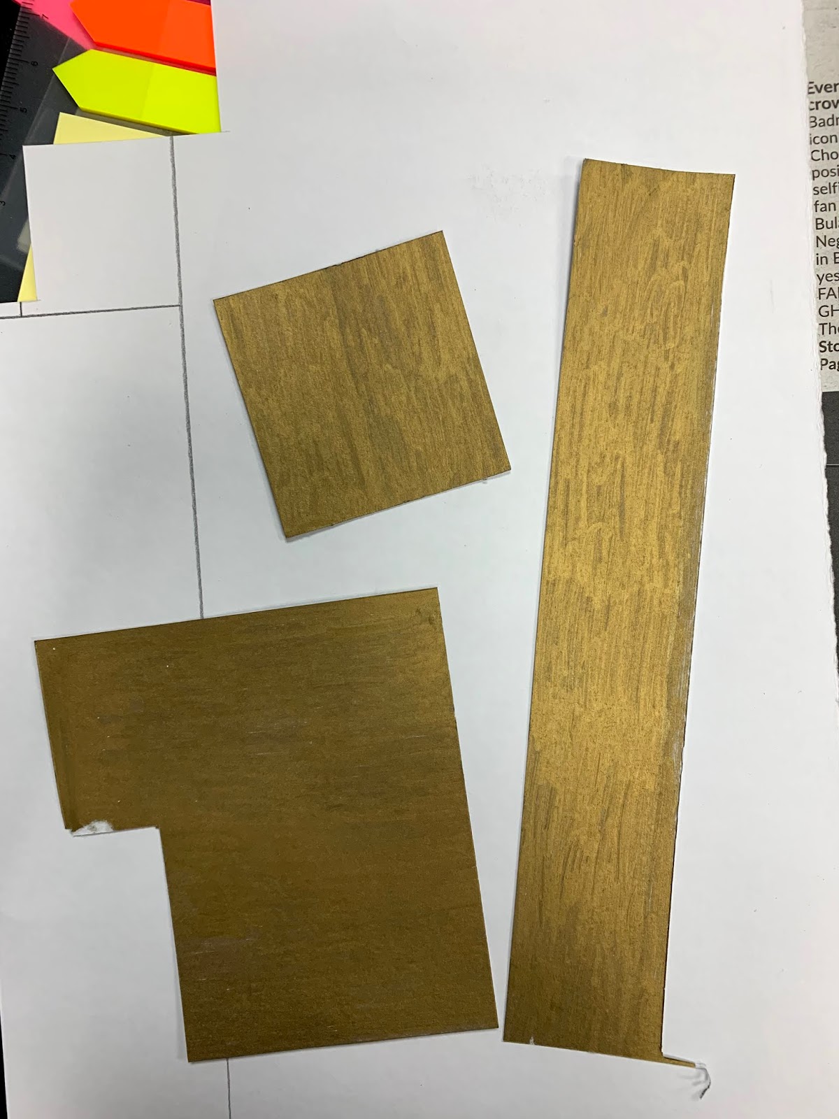 |
| Figure 7.1 some of the materials that I use in this assignment besides colored sticky notes |
 |
| Figure 6.2 Pasting various colors of sticky notes on to a piece of A4 paper |
 |
| Figure 6.3 Adding some details which is the gold cutout papers and I also add some line to show the movement. |
Dots, Line, Scale
 |
| Figure 6.1 dots into the rose |
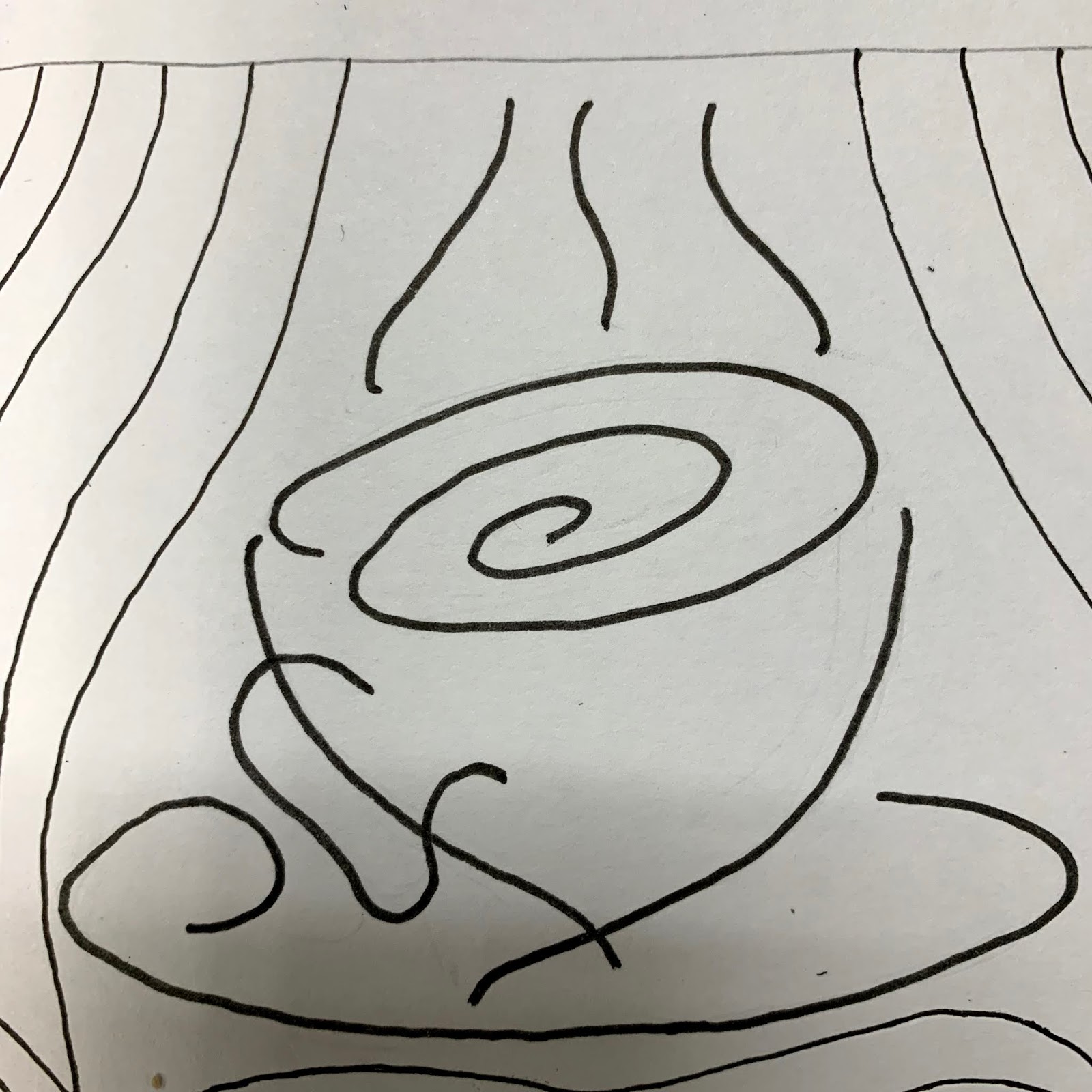 |
| Figure 6.2 line into a cup of coffee |
 |
| Figure 6.3 dots into G note |
 |
| Figure 6.4 line into an old tree |
 |
| Figure 6.5 colored |
Week FIVE:
Alignment, Hierarchy, and Direction
 |
| Figure 5.1 one line perspective. |
Week FOUR:
Texture or Pattern assignment. The things that I use to do this assignment are something that I would never think of using in designing.
 |
| Figure 4.1 The first attempt of the pattern using the bottom of the water bottle. |
The first pattern that I have created is the one I named as the lumpy circle, this texture was used with a plastic water bottle which I only used the bottom of the bottle to make this kind of texture.
 |
| Figure 4.2 second pattern using a rolled-up wet tissue and a vegetable inside the wet tissue. |
The second pattern is the rose pattern which is personally my favorite pattern among the other 2, this rose pattern was made with a small vegetable that a friend of mine gave me and a wet tissue.
The way that those 2 things can make the rose pattern is by cutting the vegetable into half and use the wet tissue to wrap it all around the vegetable and voila... the rose pattern is there
 |
| Figure 4.4 final result, the music note pattern. |
 |
| Figure 4.3 a carved music note pattern using a potato. |
And the last pattern is the music note pattern, this pattern didn't come out as what I expected it to be but with whatever reason it turns out like this. This music note pattern was created by using a carved potato and used it as a stamp to make this kind of texture.
Between Symmetry, Asymmetry, and Balance.
the ones that I choose to make is the Symmetry
 |
| Figure 3.1 cutout jar for the symmetry assignment. |
For the symmetry assignment, I tried to sketch out one side of the jar on a piece of paper and then fold the paper and cut it out so that it would look even/symmetries on both sides.
 |
| Figure 3.2 The final result of the symmetry assignment. |
Week TWO:
The Gestalt assignment is quite challenging for me because I have never created something like this before, so with a lot of thinking I finally come with an idea of what should I create in this assignment.
 |
| Figure 2.1 sketch of the fire gestalt. |
 |
| Figure 2.2 The final result of the fire gestalt. |
The idea of this assignment is to create an illusion from a sketch and in this sketch the gestalt that I was trying to create the word "fire" in the fire sketch itself. I came out with this idea because of how fire does not have any certain position nor shapes and it could be any shapes that it desires and that is why I choose to do the fire gestalt.
Week ONE:
The Contrast assignment that I decided to make is the G note logo. |
| Figure 1.1 cutout |
The cutout G note logo which is hard to cut and that's why it turns out really rough.
 |
| Figure 1.2 Final result of contrast |
The final result.


Comments
Post a Comment